 Sign In
 Register
 Help
Help


What do you think makes someone's signature effective? Take size, "whitespace", content, and images into account.
***************************
As for what I think...
- A "tag" image should be rectangular so there isn't too much whitespace. A small square doesn't seem as effective in my opinion, and a large square tends to just be too big.
- Text should be short and have a purpose. Remember that it's your signature, not a life story.
- One's signature should be designed to look good on 1024x768.
- It shouldn't stand out too badly over the rest of a thread. A big yellow rectangle will get too much attention, for example.
- To me, YouTube videos aren't effective in signatures (at least here where they can be posted). There's a lot of whitespace, and it just seems excessive in my opinion.
Page 1 of 1
What Is A Good Signature?

 MultiQuote
#2
 Ratty
Ratty 

- Bigrat2
-

- Group: Super Moderator
- Posts: 10,910
- Joined: 01-October 03
- Location:Eorthe
Posted 10 September 2007 - 07:10 AM
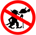
Curly, can be done quickly, hard to copy/forge.. No rough pokey straight bits like this:

and plus, that one's friggin huge. I mean, why would you want to signature your house for?

Curly is good.
and plus, that one's friggin huge. I mean, why would you want to signature your house for?
Curly is good.
Empty sig is empty.
#3
Bobette

- LOLZ.
-

- Group: New Member
- Posts: 581
- Joined: 10-March 07
- Location:Eorthe
Posted 11 September 2007 - 05:17 AM
 Ratty.
Short and to the point as far as text goes. Aesthetically pleasing? Orderly and maybe colorful (but non-clashing), as opposed to
tHiS
sOrt oF
tExT
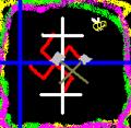
Non-text (images) should not stretch the page noticeably, and should not contain unnecessary "whitespace" (as in whitespace outside of the actual image or design itself). For example, with Nazy's signature white was a large part of a image, but I tried to crop it as much as possible so that there would not be a blank strip of white on one side. At the same time though, I didn't want the words to sit at the very bottom of the image.
With my signature I was afraid that it would take up an unacceptable amount of space, what with all it's unused space, but at the same time I didn't want to cut too close to the image or words. I also refrained from adding too much additional text or any additional images due to the amount of space that this one took up.
Hi.


#5
Zziggywolf5

- Senior Member
-

- Group: Moderator
- Posts: 2,739
- Joined: 27-June 03
- Location:Eorthe
Posted 12 September 2007 - 10:36 PM
Mine is a good signature, not the best, I admit, but still.
Signature with Explanations:
 Please do not feed the trolls. [Reminder to members on something to keep order. And I get to steal Wikipedia's bandwidth.]
 [This is just a joke, a satire on the normal sig of the member's name and something "awesome".]
Junior
Bob
Pencil and Eraser o.O [These links can distract people from my stupid or inane post.]
 [Something supportive of part of the community.]
I may be an Arbiter, but I'm also a SeeD in the Arbiter's Order. Apologies to Phieta for butchering his quote/saying... thing. [A joke to end with.]
I technically support the less is more policy, but I have yet to fix my sig to show that.
Signature with Explanations:
Please do not feed the trolls. [Reminder to members on something to keep order. And I get to steal Wikipedia's bandwidth.] [This is just a joke, a satire on the normal sig of the member's name and something "awesome".]Junior
Bob
Pencil and Eraser o.O [These links can distract people from my stupid or inane post.]
[Something supportive of part of the community.]I technically support the less is more policy, but I have yet to fix my sig to show that.

#6
Rohtaren

- no chief big fart
-
- Group: New Member
- Posts: 923
- Joined: 20-April 06
- Location:Eorthe
Posted 12 September 2007 - 11:33 PM
i'd probably say that mine isn't the best... but it is really hard to be the best. anyhow, i beilieve it just shows a bit of character and thats what a signature needs, and its compact to take up as little room as possible.

#8
Dragonman

- Senior Member
-
- Group: Super Moderator
- Posts: 6,890
- Joined: 11-November 02
- Location:Eorthe
Posted 18 November 2007 - 09:58 PM
Too much to read isn't good, unless it's extremely interesting, and even then it could just be a regular post. As for images, originality and quality are good. It has to look pleasing, while stand out in some sort of way. Personal Style > Style Whore  But it's hard if you don't have time or artistic talent and just want a cool signature.
But it's hard if you don't have time or artistic talent and just want a cool signature.

"Fifteen hundred years ago everybody knew the Earth was the center of the universe. Five hundred years ago, everybody knew the Earth was flat, and fifteen minutes ago, you knew that humans were alone on this planet. Imagine what you'll know tomorrow."
--K

Page 1 of 1